Trello gets an upgrade - New look and exclusive extra features
[Trello]

On its 10th anniversary, Trello launched one of its most important updates in the past years. With more than 50 million users, Atlassian-owned Trello has become one of the favorite project management tools around.
Trello is looking to position itself in a SaaS-driven world, and the latest updates allow users a broader overview of what's happening across the organization and help teams tear down silos across projects and tools. This new update also helps users to see data from other tools natively within Trello. The Trello team has revamped the board views and added new capabilities to the individual cards that make up those views. The platform is getting a visual overhaul as well, both to its logo and the look and feel across its website and apps to help communicate and reflect the journey of their users.
Let's take a closer look at the new updates:
1-New Visualization:
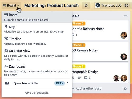
Trello gained popularity with its Kanban-style view. The visual and straightforward way of working made Trello attractive to a great number of users. The recent updates bring new ways of visualizing your boards, like a dashboard, a timeline, a table, a calendar, and more. The new views allow your team to get the overview they need to get more done.
The new views can be accessed from the view switcher button in your board's top left corner.

(Screenshot: Atlassian)
Find out more about Trello's new visualization modes here
2-Smarter Cards:
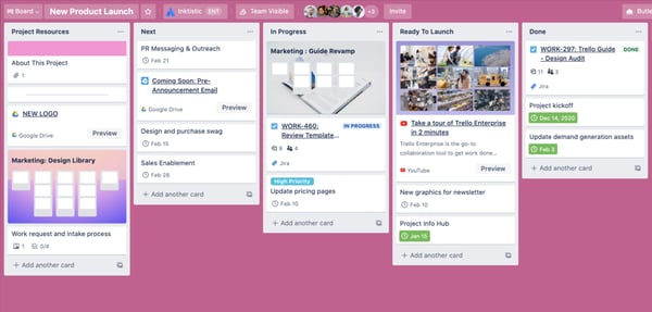
The team at Trello decided to improve how cards work, making them smarter by feeding them data from across Trello and the apps of your preference like Jira, Confluence, Bitbucket, Github, Figma, and more.
With this improvement, Trello is expecting to position itself as a work management hub.
The new Trello card types are:
- Link cards: Paste a URL as a card’s title and preview different external tools and platforms, including Youtube, Jira, Dropbox, Confluence, and more, right inside of Trello.
- Board cards: Connect projects across teams by pasting the URL of a board's card as the cards tittle. This will render a visual link to the original board.
- Mirror Cards (Coming soon): This card type reflects one card across multiple boards, keeping information aligned without having to switch board or keep multiple cards up-to-date.

(Screenshot: Atlassian)
Find out more about the new Trello card types here
3-New Sidebar With Better Navigation
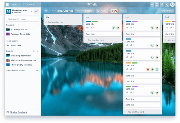
The new sidebar of Trello is localized in the left section and organized by workspace. Within each workspace you can find its boards, where you can see your starred boards, other boards within that workspace, and team level views. You might not yet be able to see this feature as Trello has just started rolling it out.

(Screenshot: Atlassian)
4-Rebrand and New Look and Feel
Trello surprised us with a new modern look. The company is refreshing their brand, updating their logo, illustrations, and messaging to create a more inclusive brand system which communicates the journey of their users.

If you want to know more about Trello or any Atlassian products contact us. We will analyze and implement the best solution for your use case.
If you don't want to miss our updates, follow us on Twitter @STAGIL_TEAM or LinkedIn STAGIL.

See how STAGIL can help you:
The first consultation is on the house! Feel free to contact us!